


When it comes to creating a website, typography plays a significant role in the overall design and user experience. The right typography can attract and engage users, while poor typography can turn them off. In this blog post, we’ll discuss the impact of typography in web design and provide tips on how to choose the right fonts to make your website stand out.
Why Typography Matters in Web Design
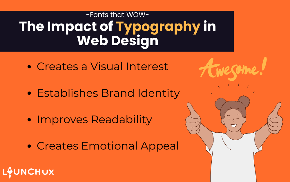
Typography is the art and technique of arranging type to make written language legible, readable, and appealing when displayed. When used effectively in web design, typography can:
- Create visual interest: Typography can be used to draw the eye to specific areas of a webpage, such as headlines, subheadings, and calls-to-action. Using a bold font, a unique typeface, or contrasting font sizes can make certain elements stand out and attract the user’s attention.
- Establish brand identity: Typography can be a key component of a company’s branding. By using consistent fonts across all marketing materials, including a website, a brand can establish a strong visual identity and make a lasting impression on its audience.
- Improve readability: Good typography can improve the readability of a website by making text more legible and easier to scan. Choosing the right font size, line spacing, and letter spacing can make a big difference in how users perceive and engage with the content.
- Create emotional appeal: Typography can convey a mood or tone that reinforces the message of the website. For example, a playful script font might be used on a website selling children’s toys, while a clean sans-serif font might be used on a website for a law firm.
Choosing the Right Fonts for Your Website
With thousands of fonts available, it can be overwhelming to choose the right ones for your website. Here are some tips to help you make the right choice:
- Consider your brand identity: The fonts you choose should reflect your brand’s personality and tone. If your brand is playful and fun, consider using a quirky font. If your brand is more formal and serious, a clean, classic font might be more appropriate.
- Keep it simple: Avoid using too many fonts on your website, as this can make it look cluttered and unprofessional. Stick to two or three complementary fonts that work well together and are easy to read.
- Consider readability: Choose fonts that are easy to read, especially for body copy. Sans-serif fonts like Arial, Helvetica, and Verdana are often used for body copy because they are simple and legible. For headlines and titles, serif fonts like Times New Roman, Georgia, and Baskerville can add elegance and sophistication.
- Pay attention to contrast: Contrast can be used to draw attention to specific areas of a website. Using a bold font for headlines or calls-to-action can create contrast and make those elements stand out.
- Test before you use: Before committing to a font, test it on your website to ensure that it looks good and is easy to read on different devices and screen sizes.
Typography Best Practices for Web Design
Now that you’ve chosen the right fonts for your website, it’s important to use them effectively. Here are some best practices for using typography in web design:
- Use hierarchy to organize information: Hierarchy refers to the arrangement of content elements in order of importance. Using different font sizes, styles, and colors can create visual hierarchy and help users quickly understand the structure of the content.
- Be consistent: Use the same fonts, font sizes, and colors throughout your website to create a cohesive design. Consistency can help reinforce your brand identity
In conclusion, typography is a critical aspect of web design that can make or break a website’s success. The choice of fonts can affect the readability, accessibility, and overall user experience of a website. When selecting fonts, it’s important to consider the brand’s message, target audience, and design aesthetic. Additionally, using contrasting fonts, pairing serif and sans-serif fonts, and adding emphasis through font weight, size, and color can all enhance the visual impact of a website.
Are you looking to elevate the typography on your website to make it stand out from the competition? Our team at LaunchUX can help. Our expert web designers have years of experience in creating stunning websites that capture the essence of your brand and provide an exceptional user experience. Contact us today to learn how we can help you create a website with typography that wows.